Feeds:
Posts
Comments

Click to enlarge

Here is something interesting… from LinkedIn Lab’s InMaps.

Using your LinkedIn network the application will attempt to encode several clusters of connections using color coded values where you can label the different groups of connections in your network yourself. This is terrific for identofying “centers of inlfluence” – larger circles within a group show the people who are most connected within each cluster.  Over time this can also be used to visually confirm Reed’s law for your own network. The clusters formed around the centers of influence in your network really do pop off the image, and delivers an easy to undersand visualization of the well known social “network effect”. 

 The results will depend entirely on the size and reach of your own LinkedIn network. Warning, a large network will take some time to examine and prepare the result set for you. In my own network (almost 1,000 connections) this takes quite a long tine. Thankfully, the application can render this in the background at LinkedIn Labs and issue you an email when complete. Each dot can be hovered over and cllicked to examine the identity and content of each LinekdIn connection plotted in the diagram in a handy sidebar channel.

Haven’t really figured out what to make of all this yet, but the visualization of my LinkedIn account sure looks pretty. 

I’m sure as this matures, there will be several uses for this application to help identify opportunities to connect with other people, either within a cluster or between clusters. The real value to me (short-sighted as it may be) was confirming and validating the network effect (centers of influence) among my own LinkedIn community using this social network visualization application.

Many Eyes…

Visualization of data in analytics is getting to be a very interesting space to explore today. Traditionally viewed as an efficient way of transferring a large amounts of information quickly, fairly common delivery methods can be seen in a variety of dashboard examples found at the Digital Insight site gallery. What is more interesting is an emerging trend to begin leveraging visualization techniques to become even more powerful when multiple people can access them for collaborative reasoning and shared insight. By building graphical displays that promote the exchange of ideas and insights, we can begin to explore the value of information in new ways. Our good example of this is the living laboratory for exploring these concepts known as Many Eyes.

As part of IBM’s Collaborative User Experience research group, the ManyEyes project  hosted at alphaworks.ibm.com represents a truly fascinating idea where people can develop visualizations in order to see and exchange information in novel ways. In 2007, Fernanda Viegas and Martin Wattenberg created Many Eyes, a web site where all us can upload data, create interactive visualizations, and carry on conversations. Their design goal is to transform visualization from a solitary activity into a collaborative one.

Visualization options available in Many Eyes (as of April 2009) range from the ordinary to the experimental to include:

  • Relationships among data points
    (Scatterplot,  Network Diagram,  Matrix Chart)
  • Comparing a set of values
    (Bar Chart,  Block Histogram,  Bubble Chart)
  • Track rises and falls over time
    (Line,  Stack, and Stack Graph for Categories)
  • Parts of a whole
    (Pie Chart,  Treemap,  Treemap for Comparisons)
  • Analyze text
    (Word Tree,  Wordle,  Tag Cloud,  Phrase Net)
  • Maps
    (US County Map,  World Map)

All the visualizations in Many Eyes accept the same data format (text analysis such as tag clouds also understand free text) where each data table consists of rows where the values in each row are delimited (separated) by tabs. The first row of the table should be “headers” that describe the columns. This format can be easily exported from databases or spreadsheets. They currently impose a size limit of 5 MB per file. This format is well documented and ManyEyes provides enough examples to get you started.

For example consider the spreadsheet data we have all come to love and hate at budget time (vastly simplified here for our purposes) typically organized and summarized as follows:

budgetexampledata

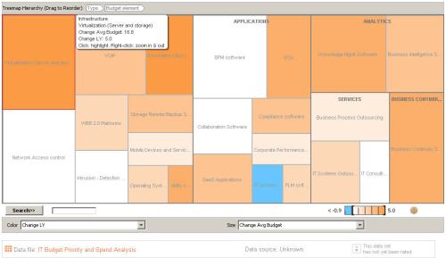
Simply uploading this into ManyEyes now quickly gives us an interactive tree map hierarchy where the data becomes a little more useful and values begin to jump off the page as follows:

budgetexample1 

The same data can be expressed as a matrix chart  summarizing the multidimensional data set in a grid. A matrix chart can be seen as the visual equivalent of a “cross-tab” or pivot table.


matrixchart


One of the more interesting visualizations is what we can do with text.  Aside from the more common Wordle (the size of a word in the visualization is proportional to the number of times the word appears in the input text) and Tag Clouds this site also offers Phrase Net and Word Tree visualizations.  For example see the United States Declaration of Independence as a wordle (prepared from the http://www.wordle.net/ site).

declarationindependence1


And the same document rendered as a phrase net.

 declarationindependence_phrasenet


A word tree is a visual search tool for unstructured text. Selecting a word or phrase and will display all the different contexts in which this phrase appears in the text. The contexts are arranged in a tree-like branching structure to reveal recurrent themes and phrases. The image below is a word tree made from the same Declaration of Independence. Font sizes show frequency of use, so you can see that among many uses of “we,” in this example the most frequent context is the phrase “hold” and “have” expressed as follows:

 declarationindependence_wordtree
 

Many Eyes is a site I recommend (although you may end up spending hours there<g>) as a starting point for you to begin thinking about visualizing data in new and meaningful ways. At the very least you will come to appreciate the value in having this living lab readily available to discover for yourself that finding the right way view your data is as much an art as a science.

We all hear about strategy and business alignment.  A lot of books have been written by a lot of very smart people about this topic.  I’m going to write about a professional journey to explore how to translate strategy into something tangible I can use to explore and measure progress to plan once execution begins using analytics and a little common sense to guide my efforts. 

This is a journey to address an important and urgent business problem; how to select the most effective sales method, quantify the results, and ensure this effort is aligned with the business. 

Why Sales?
This is subject that is very near and dear to a lot of business leaders today with the significant shift occurring across industries in the way customers decide what to buy and who they will buy from. This is further compounded by the uncertainty created in the business and political climate where cost-cutting and running for cover has become the standard response to sales offers no matter how elegantly and well executed (and sometimes heavily discounted).  And, unless you are from another universe (or the government <g>), sales is the engine that fuels everything the business relies on to remain an on-going viable entity.
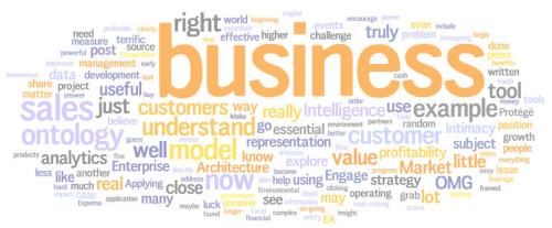
salesmodelingThe challenge for most: Sales are slipping, margins are impacted, sales cycles are expanding, growth slowing, and we no longer have the close relationships we could leverage with our best customers in tough times.

Why is this happening?
Typically 85% of a customer’s budget will be allocated to existing commitments leaving approximately 15% for discretionary spending.  We are all finding out how much harder it can become as that 15% disappears in an across-the-board cost cutting frenzy. And now making matters worse, our customer relationships have lost much of their power and leverage. With a lot less money to go around, proposals are subjected to higher and higher levels of review with our buyers. In many cases the managers we have traditionally done business with are no longer the decision makers or have been laid-off as part of the cost-cutting underway.

empirimetric1We all know this. What many may not know is Empirimetric’s analysis during the last recession of 3,000 business units from more than 300 corporations found that operating effectiveness contributes to a company’s financial performance just slightly more than pure dumb luck and random events. In fact if memory serves me the study revealed that profitability is directly and indirectly influenced by:

– Strategic moves initiated by the business: 10%
– Luck and random events: 10%
– Operating Expense Reductions: 15%
– Market Awareness, Competitive position, Customer Intimacy: 65%

So, now we have the problem or business challenge framed up and ready to explore. Applying the essential analytics to solve for this complex issue will clearly not be easy.  But what can we do, after the operating expense reductions have been exhausted? Rely on luck and random events? Hope for the 10% improvement in a strategy initiated by the business will be realized? Or go where the money is and attack the real opportunity. And this is why we are starting with the sales model – this is where customer intimacy, competitive position, and market awareness are realized.

What is a technologist doing dabbling in sales?
This illustrates a key concept I believe in. In order to deliver an effective solution you really do need to understand the subject matter to add real value.  Value in this case is helping our peers in the business understand (through our help) the true impact of what adopting a new strategy means.  In order to truly understand this subject we ask our peers (management) and the people in the field to help us understand:

– competitors better than they may even understand themselves
– position and branding in the market (market share)
– what processes are perceived as value-added from your customers
– what revenue streams are truly profitable and which are not

Now it gets a whole lot more interesting.  And tougher to achieve and measure progress to plan.  Remember we need to consider the impact to the business essentials (cash flow, profitability, velocity, growth, and customer intimacy). In Customer Relationship Management we have four generally accepted meta-processes families which we can agree on to include:

– Target to Engage (Marketing)
– Engage to Close (Sales)
– Install to Maintain (Service)
– Request to Resolve (Customer Support)

Examining the Engage to Close (Sales) process further we cam examine the underlying model used. Simplified for our purposes lets just look at two alternative models; solution and provocation (some refer to this as prescriptive). For more on the provocation model see HBR March 2009 -In a Downturn, Provoke Your Customers written by Philip Lay, Todd Hewlin, and Geoffrey Moore. They have decomposed the engage to close into three distinct activities to include:

– Qualify lead
– Make Your case
– Close the deal

So, now we have the problem or business challenge framed up and ready to explore. Applying the essential analytics to solve for this complex issue will clearly not be easy.  But truly rewarding because it does address the engine that fuels everything the business relies on to remain an on-going viable entity.  And just maybe the analytics will uncover some fresh insight into how to not only survive, but thrive in this new environment.

Peter Thomas has written a terrific post about “Measuring the benefits of Business Intelligence”. I encourage you to go see this quickly and then return before continuing on with the rest of this post.

Good, now that you have read this, I’m beginning to think we should all take a deep breath and maybe begin to frame up or organize discussions like this around themes our business partners understand – e.g. translating our findings for example across the five (and only five) essentials in business that matter; cash flow, profitability, velocity, growth, and customer intimacy.  This theme can be extended to the non-profit or government world by simply substituting the word outcome for profitability.  I guess what I’m driving at is a way to simplify our thinking and share what we are really doing in terms (lexicon) most of our customers and management can understand.  An additional perspective can be introduced here as well by using business intelligence to answer the important and urgent questions. For example I would want to know:

Are we doing the right things?

  • Uncover where the significant dollars are;  Are they really in layoffs or outsourcing?
  • Manage operational costs so that are directly tied to volume;   You should only pay for what you are using, right?

Are we realizing the benefits?

  • Why “financial re-engineering” may be the worst thing you can trust in for use in your decisions
  • Discover and measure the real value of producing profitable, sustained business

Are we doing them the right way?

  • Uncover the power of cycle compression and really do more with less
  • How to produce higher quality products and services in our work products
  • Why shared information is more accurate, timely, complete, and less expensive

Are we getting them done well?

  • How to drive costs (not merely shift them) from the business
  • Why your most valuable resources may not be focused on the highest value opportunities

expensivewatchNot sure I can even begin to answer questions like this without a good clean source of reliable data I can use in a business intelligence application. Of course, I can always guess or do what many of my potential customers will do – go with their gut feel (many of them are usually right, much like the broken watch that is correct twice a day <g>).

For more on this see an early post Where is Enterprise Architecture when we really need it and The business case for Enterprise Architecture.  Both of these posts are a little off- topic (not strictly Business Intelligence), but I believe this will provide you an little insight into what my EA peers are struggling with now – essentially the same issue in a different but related discipline.

Please let me know what your thoughts are, hoping this is beginning to shape up into a more useful organizing principal we can all share to communicate better with out business partners.

Understanding and communicating Enterprise Architecture and its role in forwarding Analytics and Business Intelligence is hard enough without having the right tools to help with model development. If you haven’t been exposed to ontology development I encourage you to grab the open source Protege Ontology Editor.  And while you are there see the Protégé Wiki and grab the Federal Enterprise Architecture Reference Model Ontology (FEA-RMO) for an example of its use in the EA world.   A few years ago Marina Arseniev and Carmen Roode at UC Irvine used this tool to model their EA environment using the Zachman Framework to publish its contents.  A little dated now, it represents an early example of how powerful this tool can be in the right hands. A more up to date set of tools can be found at the Essential project. The project uses this tool to enter model content, based on a model pre-built for Protégé. A subject for another post the Essential Project provides a useful, active forum for sharing ideas and experiences of applying practice to real world business problems – as well as working together to shape the development of relevant tools.

Tired of frameworks (and who isn’t <g>)?
While you are at the Protégé Wiki grab some of the OMG specifications developed for use with this tool for other examples.

or how about a something more interesting (Semantic Web for Earth and Environmental Terminology (SWEET)

I have watched this team evolve and mature this product over the last couple of years into a truly useful tool. Thanks to the hard working people over at the Stanford Center for Biomedical Informatics Research at the Stanford University School of Medicine we now have another powerful tool to make our lives and  little easier and more rewarding.

Have to compliment Zillow (http://www.zillow.com/) on a terrific job and example we can all learn from with their Zillow Real Estate Market Reports for US Home – Values Fourth Quarter: October-December 2008. Visually appealing, intuitive, and just the right amount of graphical interest I believe this represents a truly useful example of an effective analytic application. Combining the geography and value trends in an interactive “heat map” like this is, well brilliant. Data values can accessed for the nation and 161 MSAs by clicking on the Excel icon, or clicking a graph for a collection of maps suitable for printing. Even the Excel download includes more than just data – a glossary of metadata defining the columns with active links to each tab.  Well done, exceptional value, this is a terrific example of effectively conveying a wealth of information (not just data) in a way that is immediately useful.

Gartner has published (Feb-05-2009) its Magic Quadrant for Business Intelligence Platforms. Go get the report at http://mediaproducts.gartner.com/reprints/sas/vol5/article8/article8.html and read the Q1 results for yourself. Interesting observations noted in this research about the impact of the consolidation occurring with the “megavendors” from discussions in a survey of 480 vendor customers conducted in late 2008.

[Gartner RAS Core Research Note G00163529]
James Richardson, Kurt Schlegel, Rita L. Sallam, Bill Hostmann

The Forrester Wave for Enterprise Data Warehousing Platforms, Q1 2009 is now available from our friends at Teradata. I guess the fact that they are considered one of the leaders in this space had something to do with this <g>.

Go get the Forrester report (Published Feb-06-2009) at http://www.teradata.com/t/WorkArea/DownloadAsset.aspx?id=10115 and read the Q1 results for yourself. And let me know what you think about their (Forrester) findings.

Best of Intentions

Welcome to the Essential Analytics. Will try to keep this as entertaining as possible and encourage all to contribute and share their personal and professional experiences here. This eclectic collection of posts will in many ways reflect the wide variety of issues will all encounter in our daily professional lives.

I’m pretty passionate about this and feel I know a little bit about what works and what will not from bitter experience and the help of a lot of smart people (smarter than I am) I have learned from over the years. Not a really a legend in my own mind, I just feel it is the right time to share my experience in this space with others.  In my career I have led or participated in a leadership position in building:

  • Seven (7) large scale (over 1TB) data warehouses designed, built, and deployed in the Financial Services, Transportation, Supply Chain, Retail, Utility, and Professional Services industries
  • Over twenty (20) data marts (special purpose subject areas) designed, built, and deployed in the Financial Services, Transportation, Supply Chain, Distribution, and Utility (Power) industries
  • Eight data warehouse executive assessments prepared and delivered for management review and action. In addition, five (5) detailed business cases prepared to support the investment in the analytic environment.

Impressive? Yes, maybe. Experience? You bet, if there is a mistake to be made or a “bonehead” decision I can tell you I have probably made them all. Which is why I think it is important to share this experience with all who want  to take advantage of this knowledge. My sincere intent is to forward claims and assertions made in this blog to reflect generally accepted time proven best practice principals that have demonstrated value we can all share.   Hopefully you will find the topics that represent this experience worthwhile to you.  

Thank you for your interest, hope this will meet your expectations and you will become a regular reader and contributor.